
Namrata Rajpal: three ways to say the same brand, until one was right.
A new clothing label launch, built from three genuinely distinct logo directions through to a finished system — tags, packaging, carry bags, and stationery — ready for a first production run.
A launch brand only gets one first impression on the hanger.
A new clothing label has no history to lean on — the identity has to do all the work of signaling craft and price point the moment a customer touches the tag or opens the box. That meant the logo couldn't just be decorative; it had to hold up shrunk onto a cloth tag, printed on kraft packaging, and stamped on an invoice, and still feel like the same brand in every context.
Three real directions, not three variations of one idea.
Rather than presenting one safe concept, three genuinely different monogram approaches were developed in parallel so the client could react to real alternatives — a geometric interlocking mark, an illustrative crest built around symbolic linework, and an ornate framed monogram with a thread-spool detail tying it back to garment-making itself.
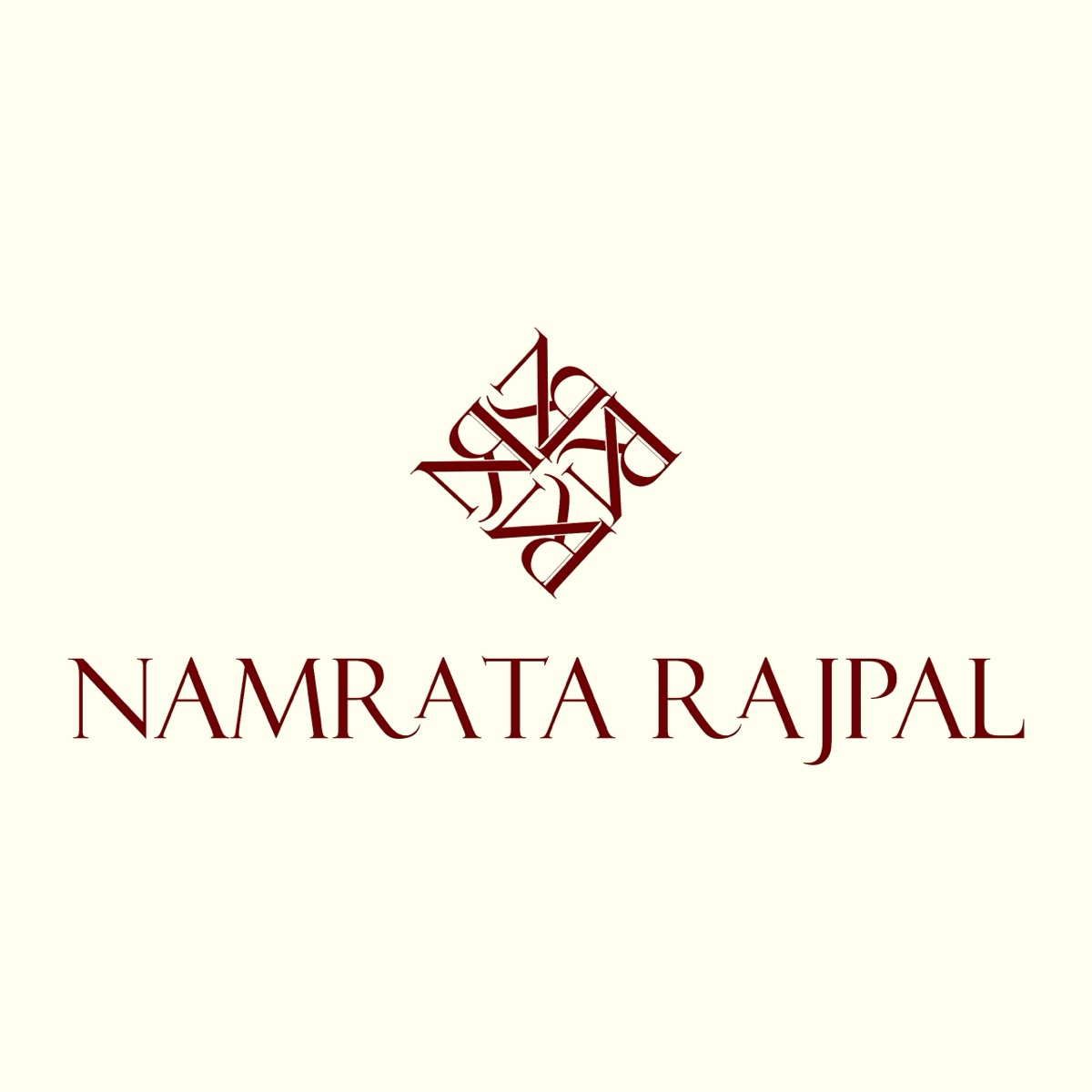
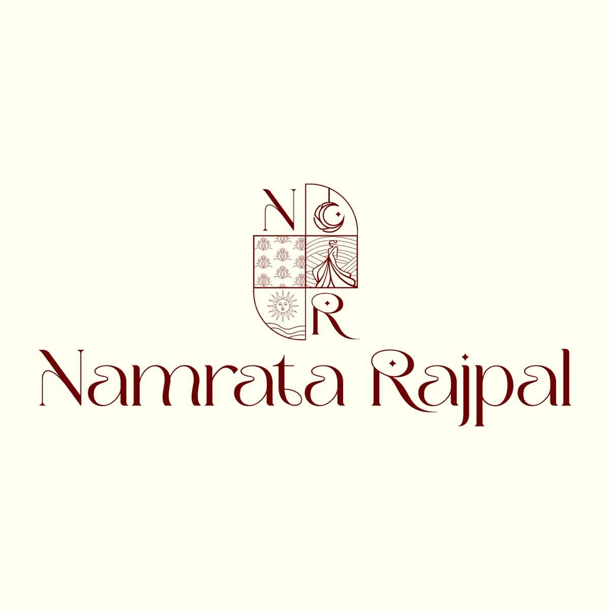
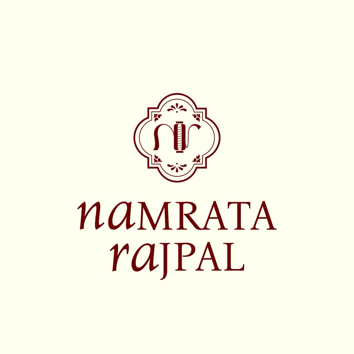
The winning direction took its cue from a moodboard built around warm neutrals, botanical linework, and copper-gold foiling — the same instinct that ended up shaping the name itself. What started as a straightforward “Namrata Rajpal” became the stylized Namrataa Rrajpal Couture during the identity work: doubling the vowel and the consonant turned a common name into a wordmark distinct enough to own outright, on a hangtag, a hashtag, or a search result.
From a chosen mark to a complete production-ready system.
Once a direction was chosen, it was built out across every physical touchpoint the brand needed for launch — cloth tags, gift packaging, carry bags, and stationery — not just a logo file handed off and left to be figured out later.
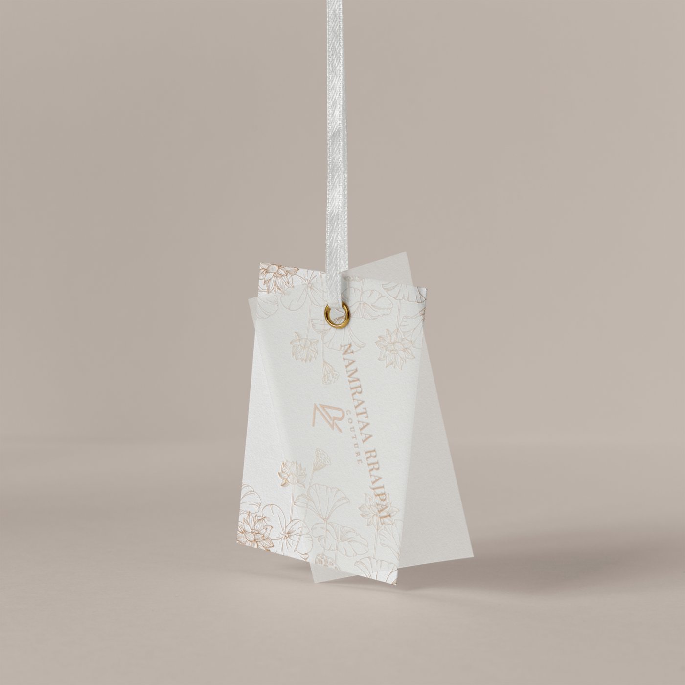
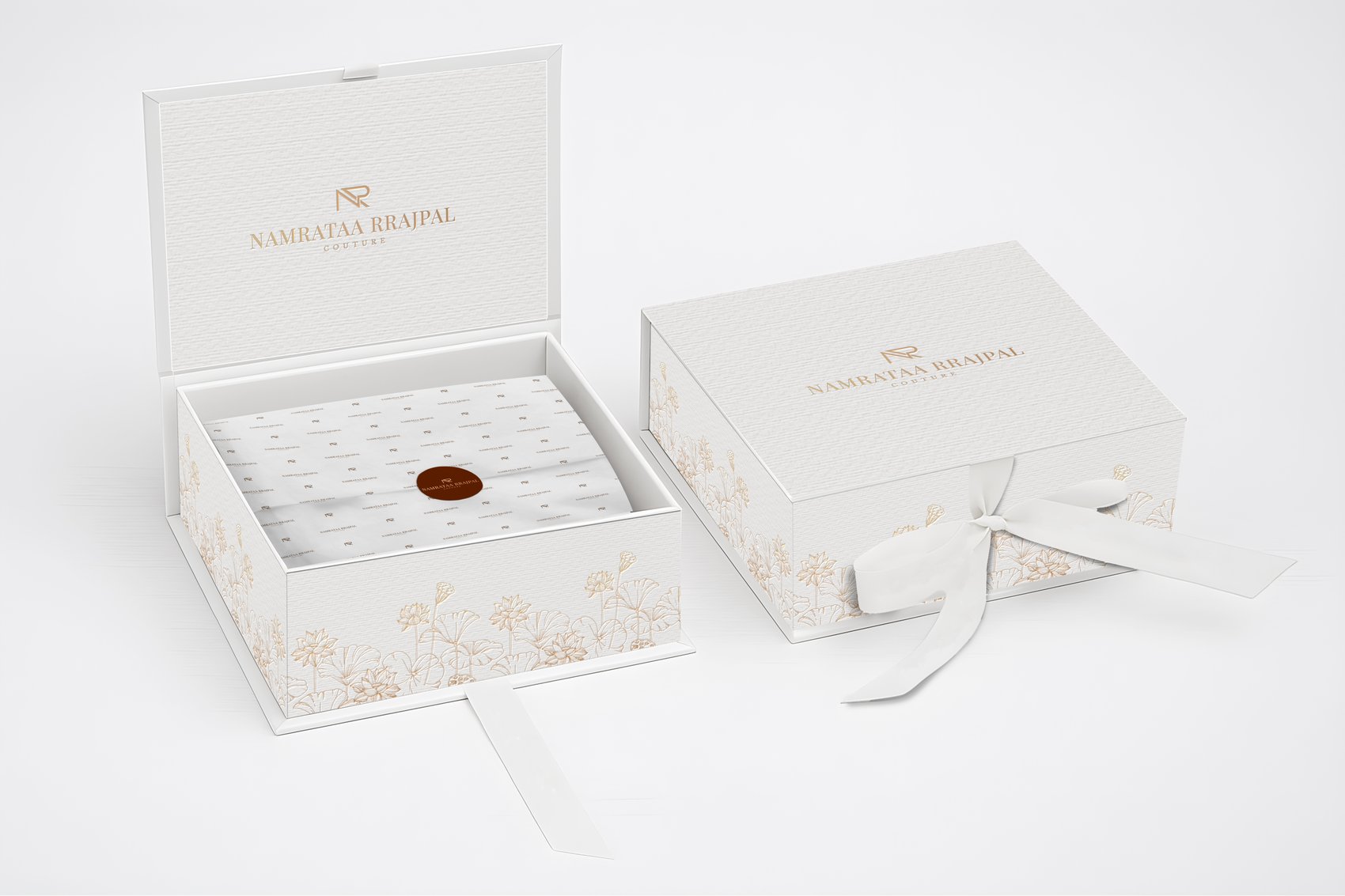
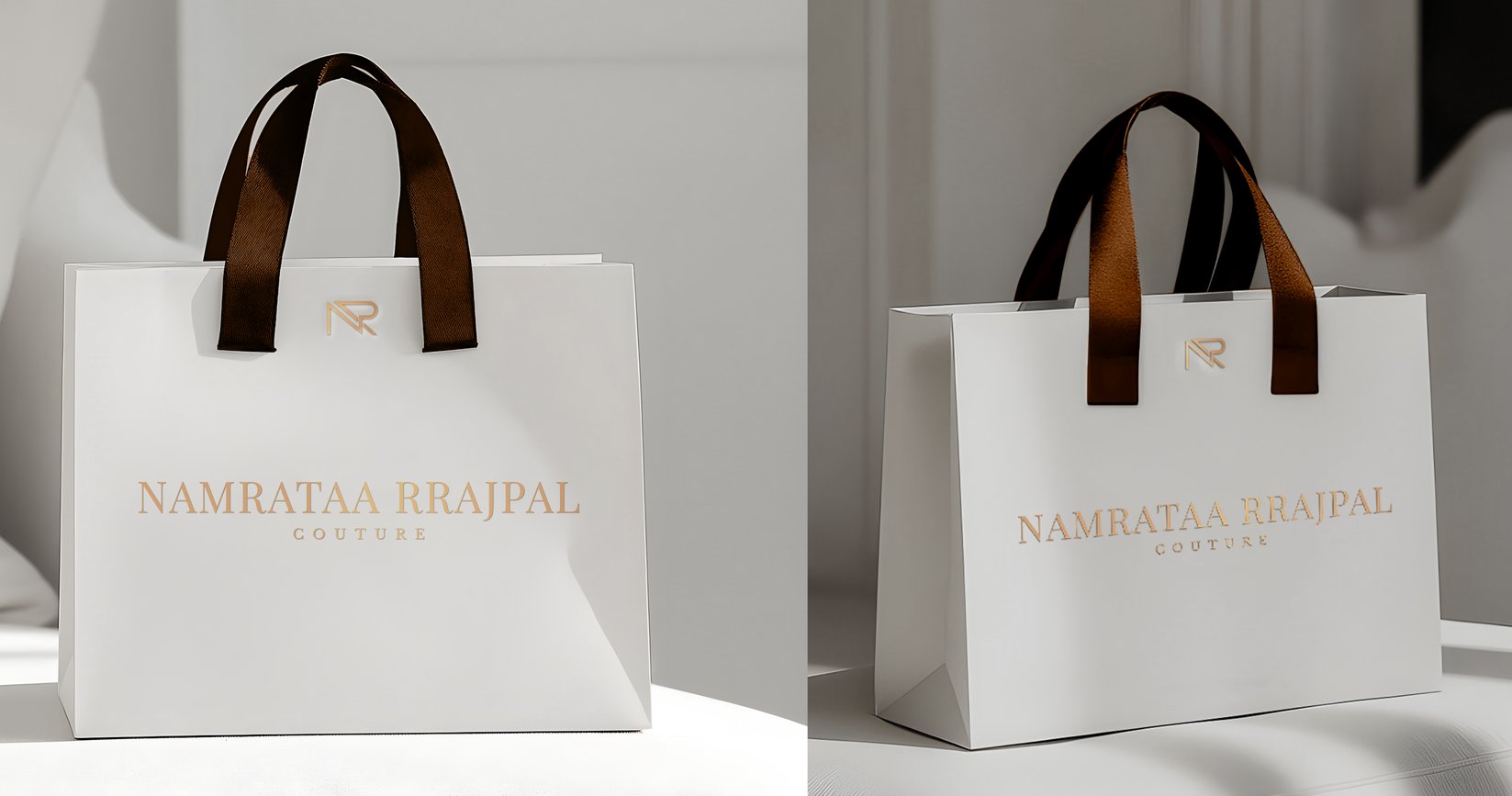
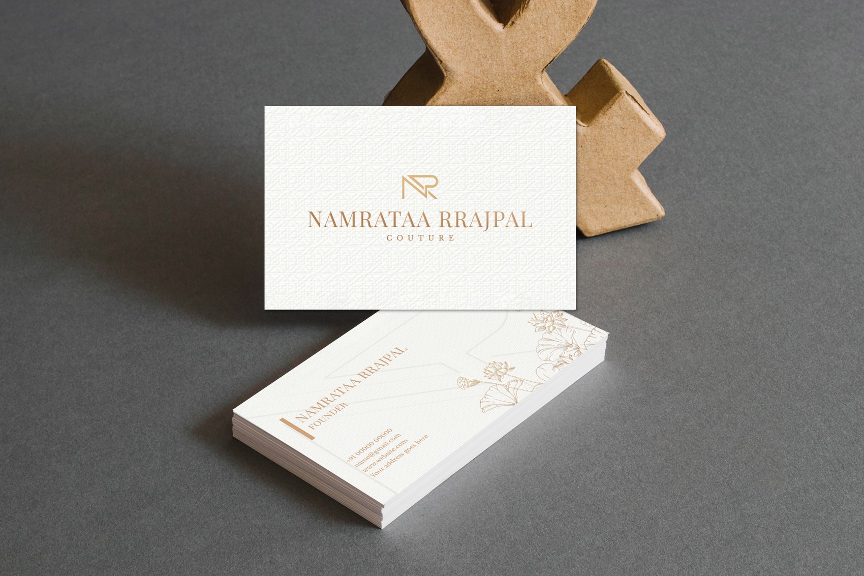
Three colors, used consistently everywhere: ivory across every substrate, espresso for the wordmark and fine linework, antique gold foil reserved for the logo mark and ribbon detailing. Nothing in the system introduces a fourth color — that restraint is what makes paper, card stock, satin ribbon, and cloth all read as one brand.
Launching a product line and need more than a logo file?
Tell us what you're launching and every touchpoint it needs to show up on.