
Primary lockup
Icon and wordmark together, for the website, proposals, and anywhere the full identity needs to appear.
A real estate and construction group needed a logo that could sit on a site hoarding, a business card, and a legal document with equal weight — permanent and established, not trendy.
Real estate and construction buyers commit large sums to a name they need to believe will still be around when the building is finished. A logo in this category has to skip the trend cycle entirely — it needs to look like it belongs on a foundation stone as much as on a website, without leaning on the obvious visual shorthand of a skyline or a crane.
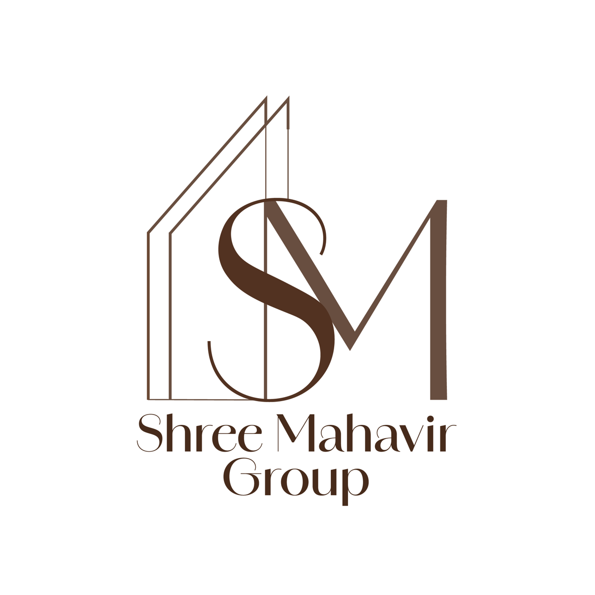
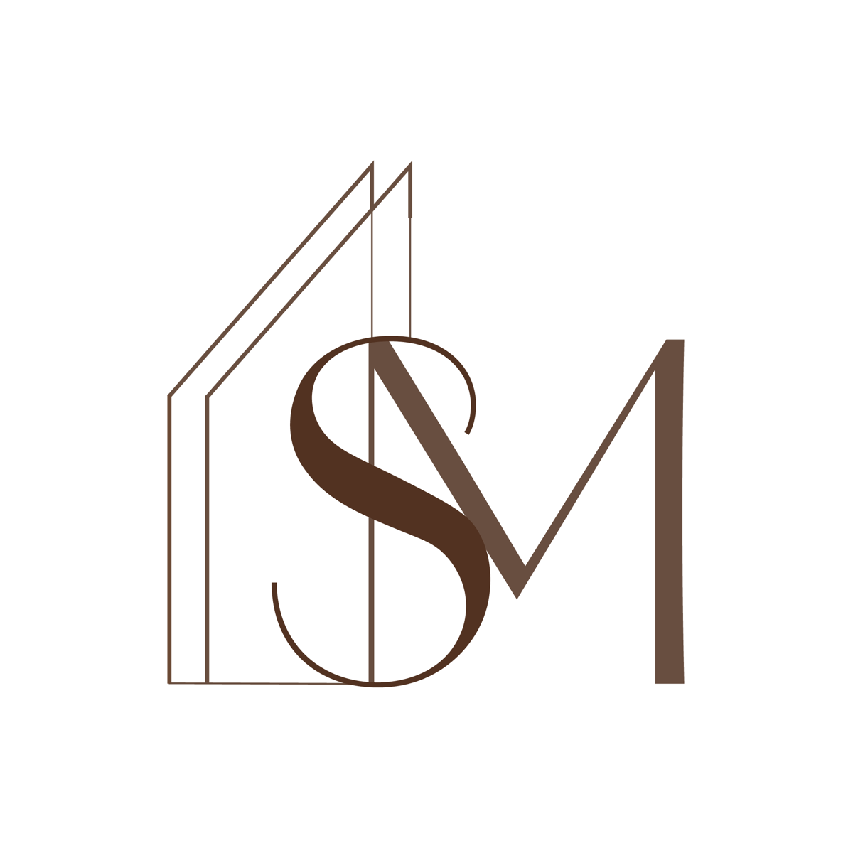
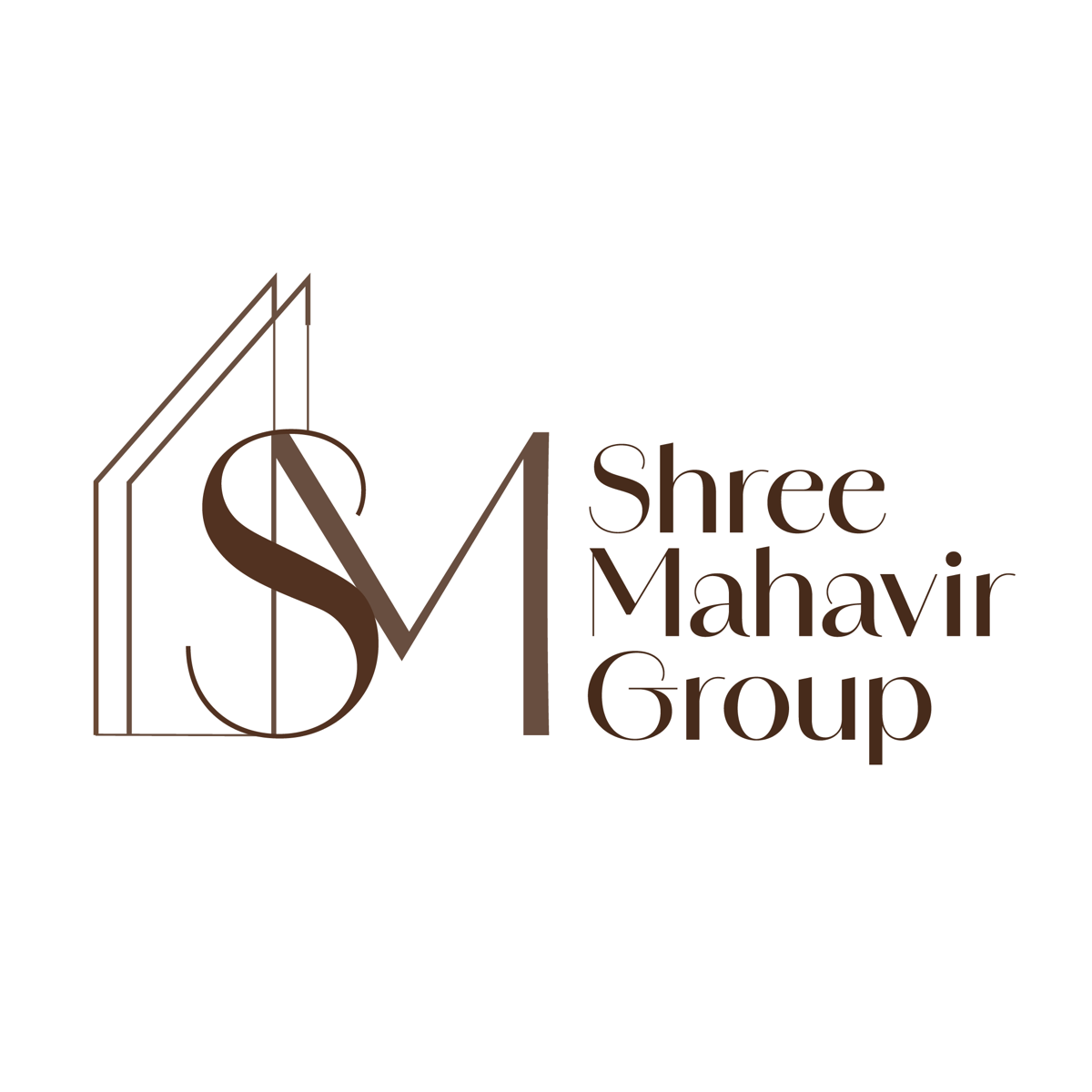
The monogram integrates the group's initials into a roofline shape — a direct nod to the business without resorting to a literal building silhouette — paired with a serif wordmark that carries the weight and formality the category demands.
Icon and wordmark together, for the website, proposals, and anywhere the full identity needs to appear.
The monogram alone, built to stay legible at favicon size and on site signage from a distance.
A standalone type treatment for documents, letterheads, and contexts where the icon would compete for space.
Tell us about your business and who needs to trust the name on the building.