01 — The problem
FAFF is a personal assistant service that lives entirely in WhatsApp. There was no established category to compare it to, no familiar interface to show, and no way to rely on a visitor already knowing roughly what they were looking at.
02 — The job
Make someone understand what FAFF is, quickly — and make the service feel as easy as it actually is. If a visitor had to work at understanding it, the site had failed.
03 — The decision
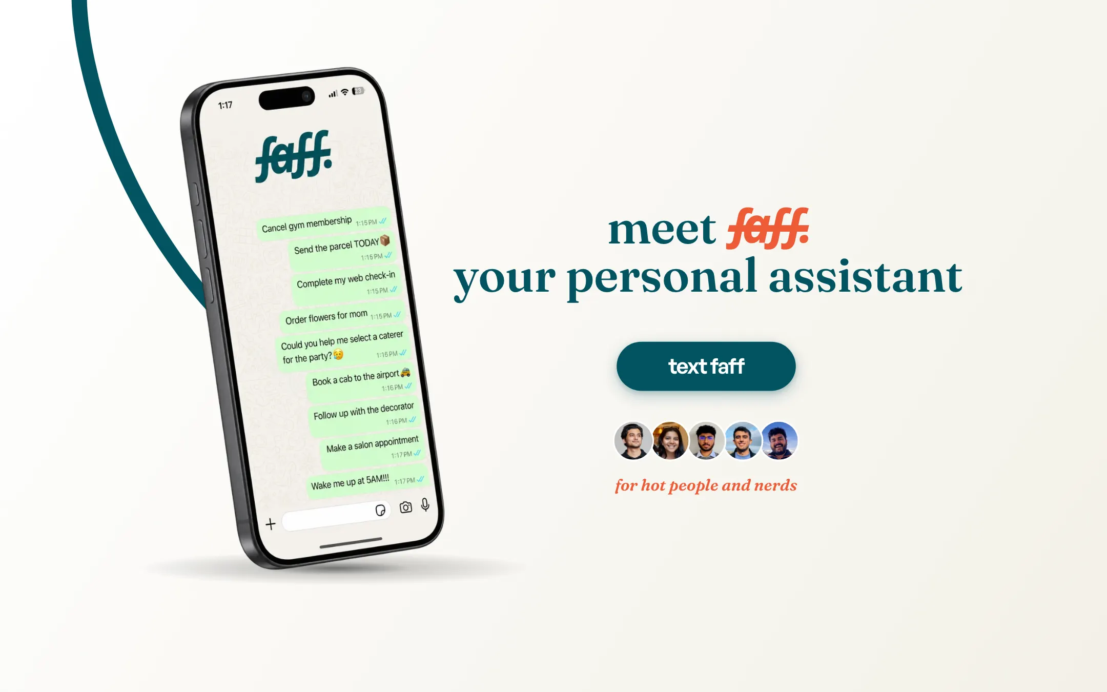
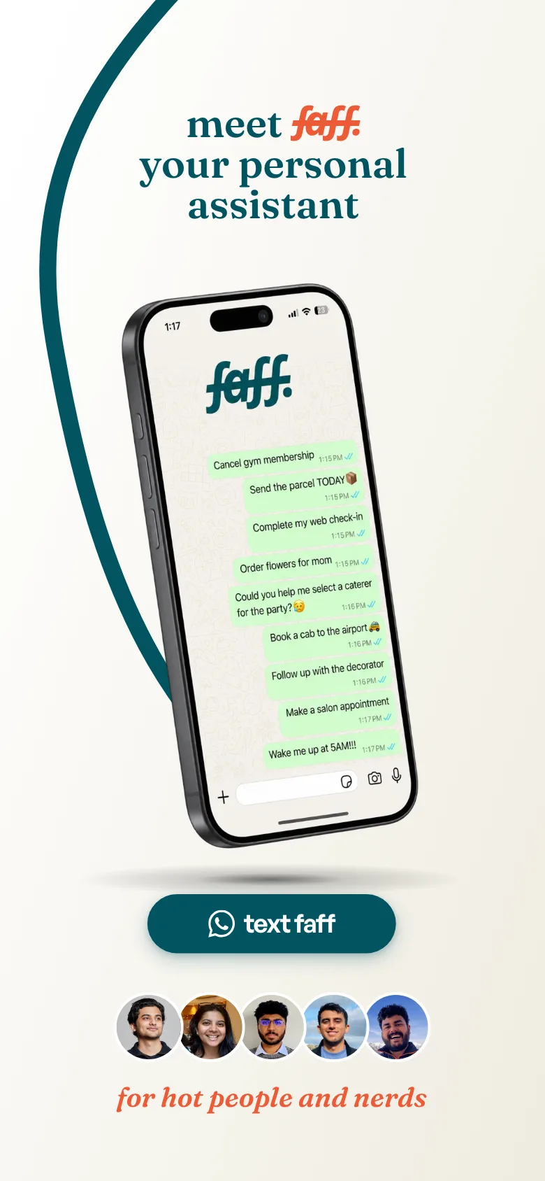
Strip out the explanation. Rather than describing the service in paragraphs, the site shows the thing itself: real requests, in a real chat, the way anyone already knows how to read. The interface people would use became the way the service was explained.
A service nobody had seen before, explained in one scroll.
04 — What we built
- A single scroll
- One page that introduces, demonstrates and asks — no menu of sub-pages to hunt through before the idea lands.
- The chat as the demo
- Everyday requests shown in the WhatsApp format the service actually runs in, so the format does the explaining.
- Motion with a job
- A scroll-driven opening that builds the idea in order, rather than animating for its own sake.
- Mobile as the real case
- Designed at phone width first; this is a phone service and almost everyone arrives on one.
No traffic or enquiry figures here: we have not verified this project’s analytics ourselves, and we would rather show nothing than a number we cannot stand behind.
05 — What it taught us
Three things we took into the next project.
Show the interface, don’t describe it
When a service is unfamiliar, a picture of the thing working beats a paragraph about what it does. We now reach for this first on any launch site.
Familiar formats do the heavy lifting
Borrowing an interface people already read fluently — a chat thread — removes most of the explaining before a word is written.
Fewer ideas per screen
One scroll with one idea per screen beat a structured multi-page site, because the problem was comprehension, not navigation.